
PotteryBarn: Lilly Pulitzer
A common opportunity with online retail is partnering with an existing brand to create cross-brand synergy to promote brand awareness to a new demographic. Lilly Pulitzer is a colorful and vibrant brand that exudes Miami-chic which was exactly what Pottery Barn needed for whimsical pops of color in an otherwise beige brand
This partnership wound up being the largest grossing in products sold in 2018. Many items were sold out due to poor forecasting

Catalog
It was quite challenging to get the creative owners of both brands to approve images that represented their brands respectively. There were a lot of egos at play but the final imagery managed to come through. The Lilly Pulitizer patterns are quite loud and graphic in comparison to Pottery Barn’s subtle branding. I’m not a stranger to working diplomatically through these types of situations.
In hindsight, I think we could have done better with a lead image as the both the PB and LP logos are really hard to read against the leaf wall.

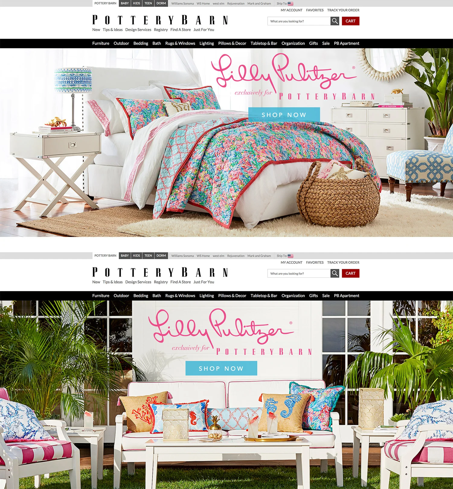
Website
To the right are two examples of the homepage heroes. It was really fun for the team to see the traditional Pottery Barn logo in a hot pink!
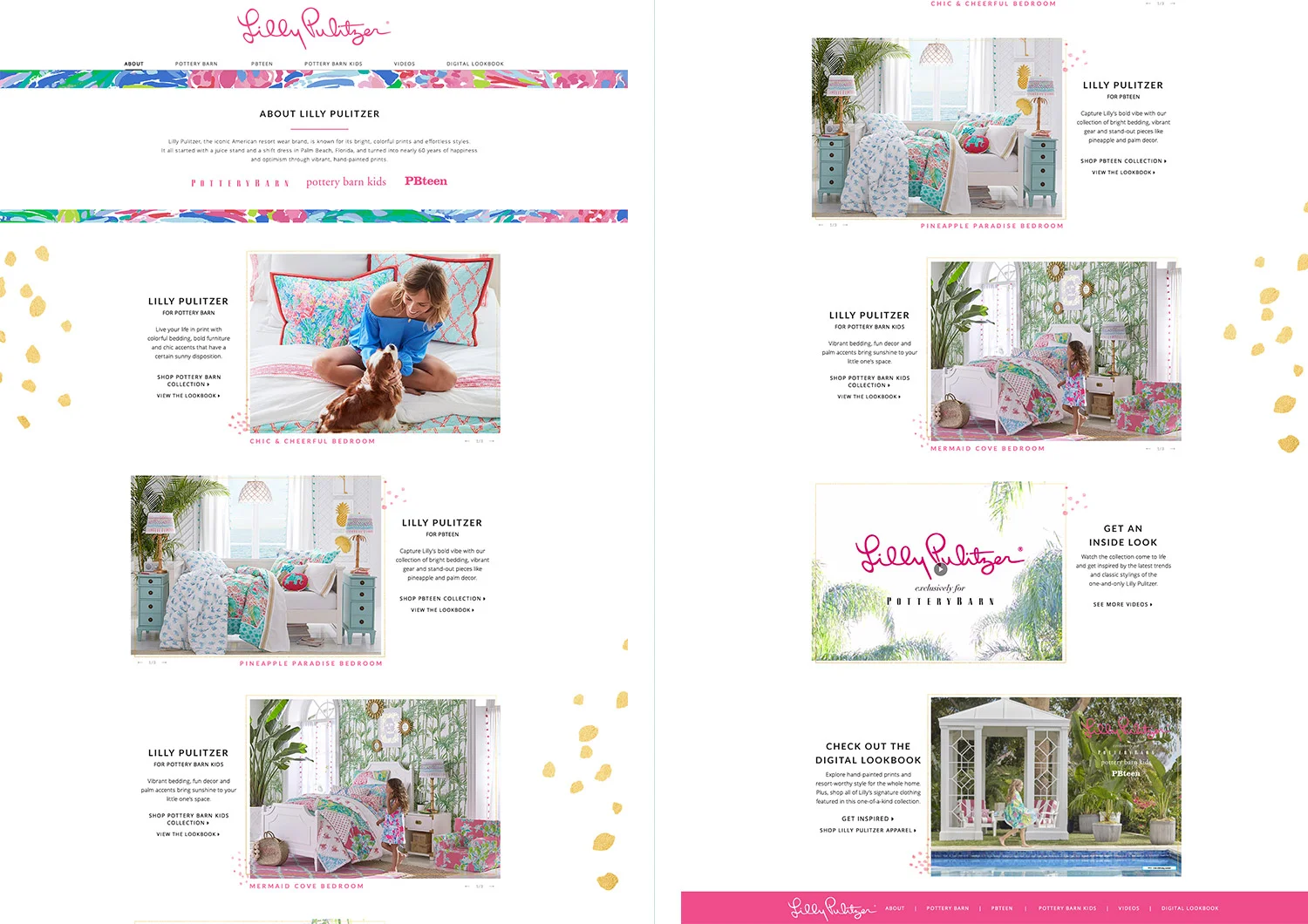
Below are the mocks for the microsite:
Lead Designer: Sara Creef

Lead Designer: Sara Creef

Emails
The email team did an excellent job bringing the merged brands into effervescent designs. Below, from left to right we have the Coming Soon, Early Access, Bedroom Category, and Outdoor Collection Category emails. Unfortunately Pottery Barn’s back end format did not allow us to make these emails responsive. That would have made this project even more successful in my opinion.

Lead Designer; Shane Tango