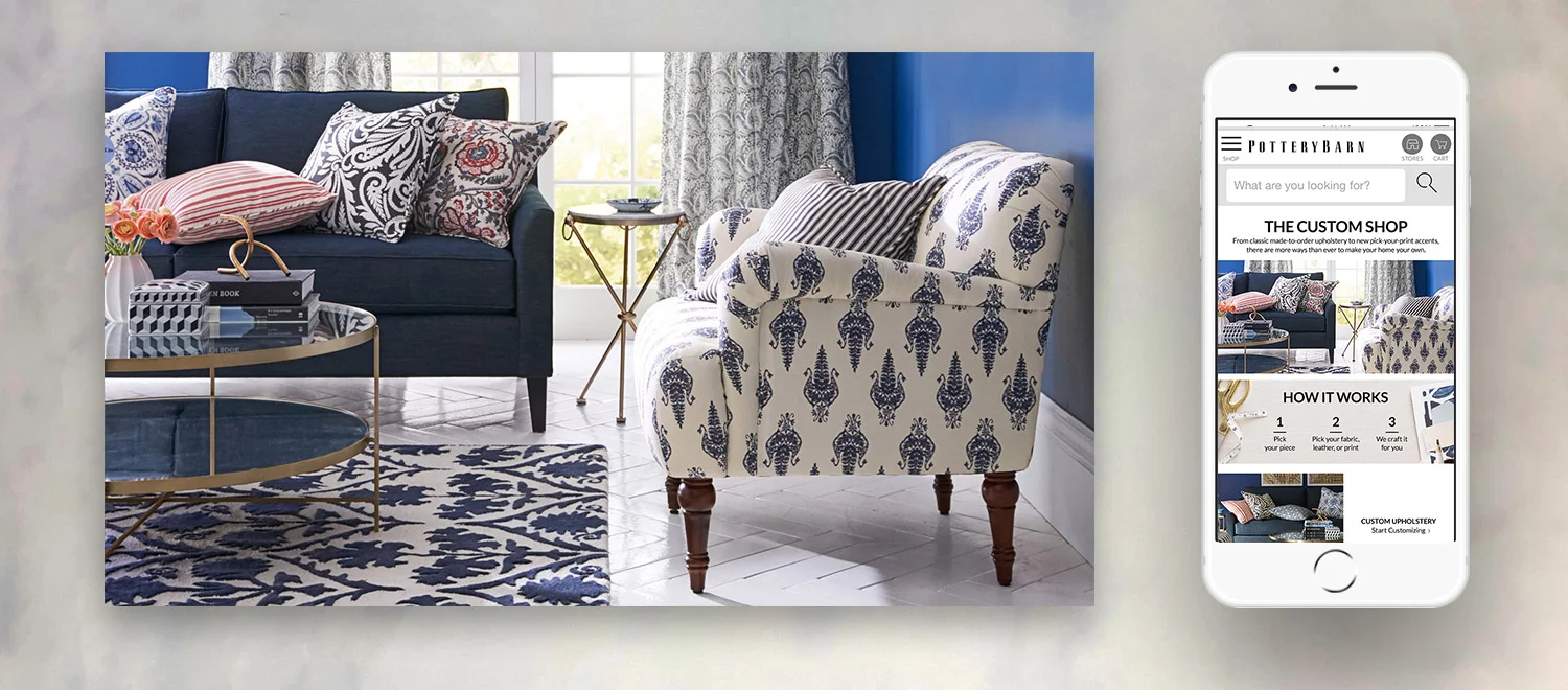
PotteryBarn.com: Custom Upholstery
In March 2018 Pottery Barn launched a new product feature to allow online consumers to select custom prints for various furniture categories like, pillows, rugs, accent chairs and sofas. As a new feature, what would be the best way to educate the online consumers?
We knew we could create dedicated emails and use the print catalog but we had to be strategic of how we would place this information online. Let’s take a look at how we got to the final design.
Research
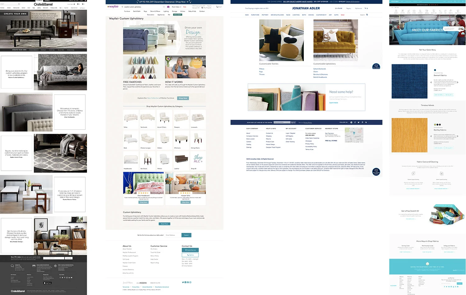
Competitive Analysis
We referenced other best-in-class sites that offered customizable options that included Crate & Barrel, Jonathan Adler, and JoyBird to name a few. How did they tell the story of custom upholstery?
We noticed many sites used video and multiple pages to explain their process but often needed too many clicks to actually get to product that could select custom upholstery options.

Card Sorting + Customer Journey
For a clearer understanding of how online consumers shop for custom options, we brought in 10 consumers who were ready to do some redecorating in their home.
Our research team asked a series of scripted questions such as: Do you normally start with a product specific or room specific project? How quickly do you want to find product? Do you have a pattern or color scheme in mind? etc.
Once we got their responses we were able to card sort their answers. We indicated how many times the same answer was recorded to helped create a prioritization of content hierarchy.
User Flow
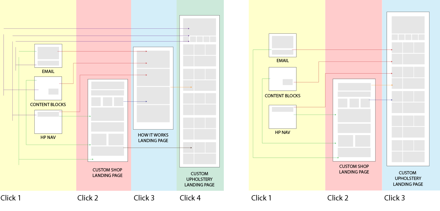
Product management’s initial ask was to create a “Custom Upholstery” landing page as well as a “How It Works” landing page. Although this would ultimately create a more aesthetic experience, it was clear from our online consumers they wanted to get to product in fewer clicks so we made a “Custom Upholstery” and “How It Works” hybrid page which eliminated an additional click.
Final Comps

Product Design: Shane Tango, Copy: Emilee Schumer
Desktop
PMs were adamant we keep two separate landing pages so we tested both and ultimately the option with fewer clicks won by 23% increase in conversion. Here’s a great example where testing is a simple execution indicator and initial hypotheses aren’t always the winner.
User research also helped us prioritize our product hierarchy in our “Start Customizing” section.

Product Design: Shane Tango, Copy: Emilee Schumer
Mobile
For the mobile version, we tested the above by shifting some of the content blocks around. Even though this mock lost to the original winner it’s always a good exercise to find better iterations of any design. It’s very important to make sure to incorporate “brick” modules for quick testing.