
Wayfair: Branding
I joined Wayfair right as they were re-branding themselves from the multitude of CSN stores online. I was integral in establishing the new tone and voice for Wayfair visually as well as by way of copy. The goal was to reach a mass audience by being conversational, accessible, and “punny.”
Design Evolution vs Design Revolution
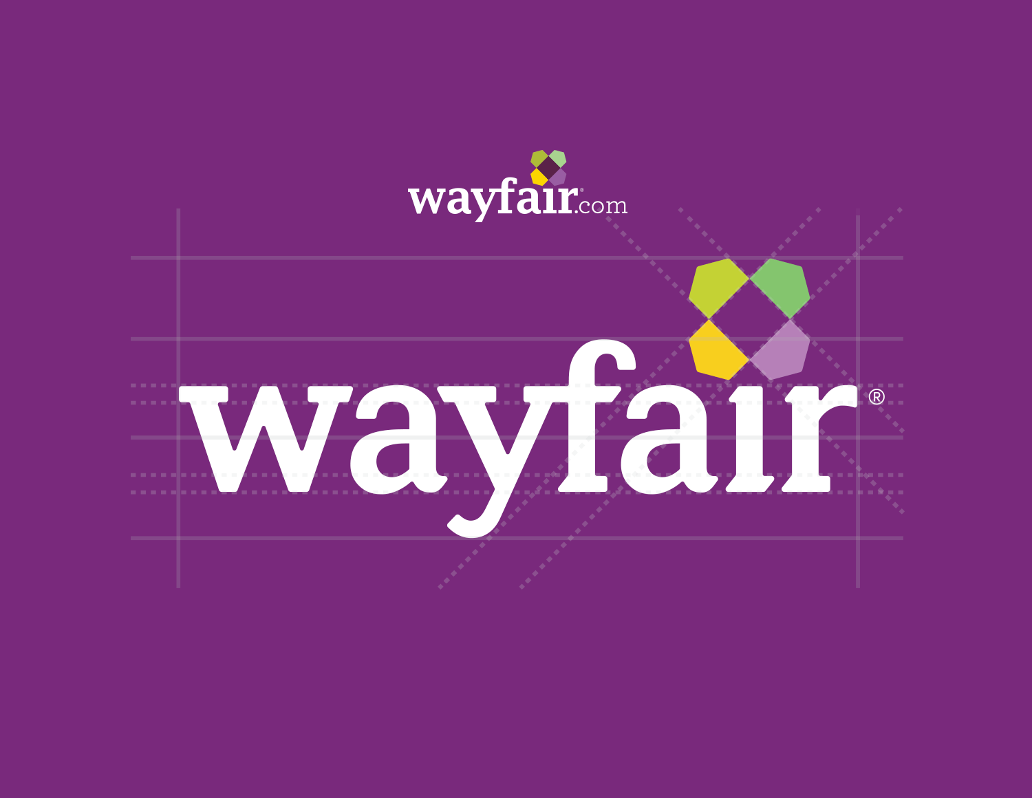
Back in 2012 the Wayfair logo included “.com” and used dark print centric colors. A lot of money had been placed into the re-brand so my job was to establish a subtle design evolution to make the logo work better for digital needs. By 2015 we dropped the “.com” for the website, shrunk the pinwheel, used web safe colors, and eventually moved the pinwheel to the left making it easier to place in a header. If you look carefully you will also notice we softened the serifs and added a curved tail to the “Y” to make the logo more playful.
Below you will see how the site evolved as the brand did.

Style Guides
Marketing Guides
While at Wayfair it was important to create working docs both consumer facing and internal facing. It was important for me to give Wayfair Creative a voice at the decision making level internally as well as a brand voice for the consumer. By creating these guides, we eliminated internal PM and Senior Management personal and subjective feedback so we could focus on consumer and functional feedback. If requests didn’t meet brand guidelines that were established, we’d move on. The following guides focus on consumer facing guidelines.


Seasonal Guides
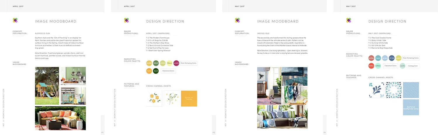
To keep E-marketing fresh, we developed seasonal style guides to make sure all of our marketing materials were visually consistent across web, print, direct-mail, and TV. Textural elements and colors were incorporated to match the season’s category initiatives and most recent photography.
Direct Mail

Catalogs
When I first started at Wayfair, it was truly an online tech company. I often asked Niraj and Steve (the two founding CEOs) when we would break into print and TV and they laughed at the proposition. Eventually they agreed to test these mediums and found they were incredible revenue drivers as well as consumer acquisition opportunities for the online home decor shopping landscape.
As a data driven company, we tested how direct mail pieces performed via creative, number of pages, categories, etc. My challenge was to include content driving ideas along with references to shopping online. We measured conversion of each mailing because ROI has always played a huge part in Wayfair’s design execution.

E-Marketing
Emails
It’s been an incredible observation to see where Wayfair emails started and where we landed. In 2012 creative executed mobile and desktop versions of marketing emails that were not automated (Daily Promotions that pulled imagery from online assets). By 2014 it was mandatory that one email design be responsive for both desktop and mobile via stacking and live text outside of images. This increased creative productivity by eliminating creative production.


Display Ads
Display ads might likely be the bane of every designer’s existence but so integral in consumer acquisition and personalization. At Wayfair we had a dedicated team that focused on creating automated display ads as well as seasonal campaigns. These ads were all tested to death and a great learning was what we thought were our best looking ads were not always the best performing. Results really laid in the eyes of our consumer.
Way Findings

Workspace Signage + Elevator Walls
By 2016 Wayfair had 6,000+ employees in the Boston Copley towers that housed a multitude of open work spaces as well as mini conference rooms. We needed an easy way to find where a meeting space was located.
Way Findings signage was created to allow employees to find their meeting space and elevator corridor murals were created for external visitors to meet their respective counterparts. Below are examples of how we incorporated the different Wayfair sister brand photography on each floor.


Billboards
Marketing research showed that brands that offered brick and mortar establishments found an increased visit to their online counterpart. Wayfair’s solution for being solely an online entity was to buy billboard space for similar physical marketing. We targeted the cities of Boston, Chicago, Dallas and we found a huge increase to online visits due to these locally targeted billboards.
This essentially led to Wayfair investing in signage on the exterior of the Wayfair headquarters in Boston.
Video

TV Commercials
Video is an extremely expensive form of marketing. As with other marketing materials, a close eye was placed on video to make sure ad spend generated a positive ROI. The Wayfair musical quickly became the best performing ad (you either love or hate the jingle — sorry not sorry!) and took years to beat through multivariate testing. The following are a few examples of the best performing ad, the behind-the-scenes of that ad, and a content piece that not only provides decor advice, but also references how to shop online.